
Aiglon, a profoundly European French typeface, is available in five different widths, each one proposed in eight weights with italics for a total of 80 styles.
→ Download now the pdf specimen of Aiglon.→ Buy Aiglon at Typofonderie.→ Download the free Try-out version of Aiglon in 80 fonts.
A melting pot of typographic possibilities
Aiglon is a monolinear, semi-grotesque, semi-geometric sans serif typeface. It is an open face, very sober yet recognizable, thanks to its unique characteristics. Aiglon is also a multi-faceted, adjustable typeface that meets a variety of European aesthetic canons.
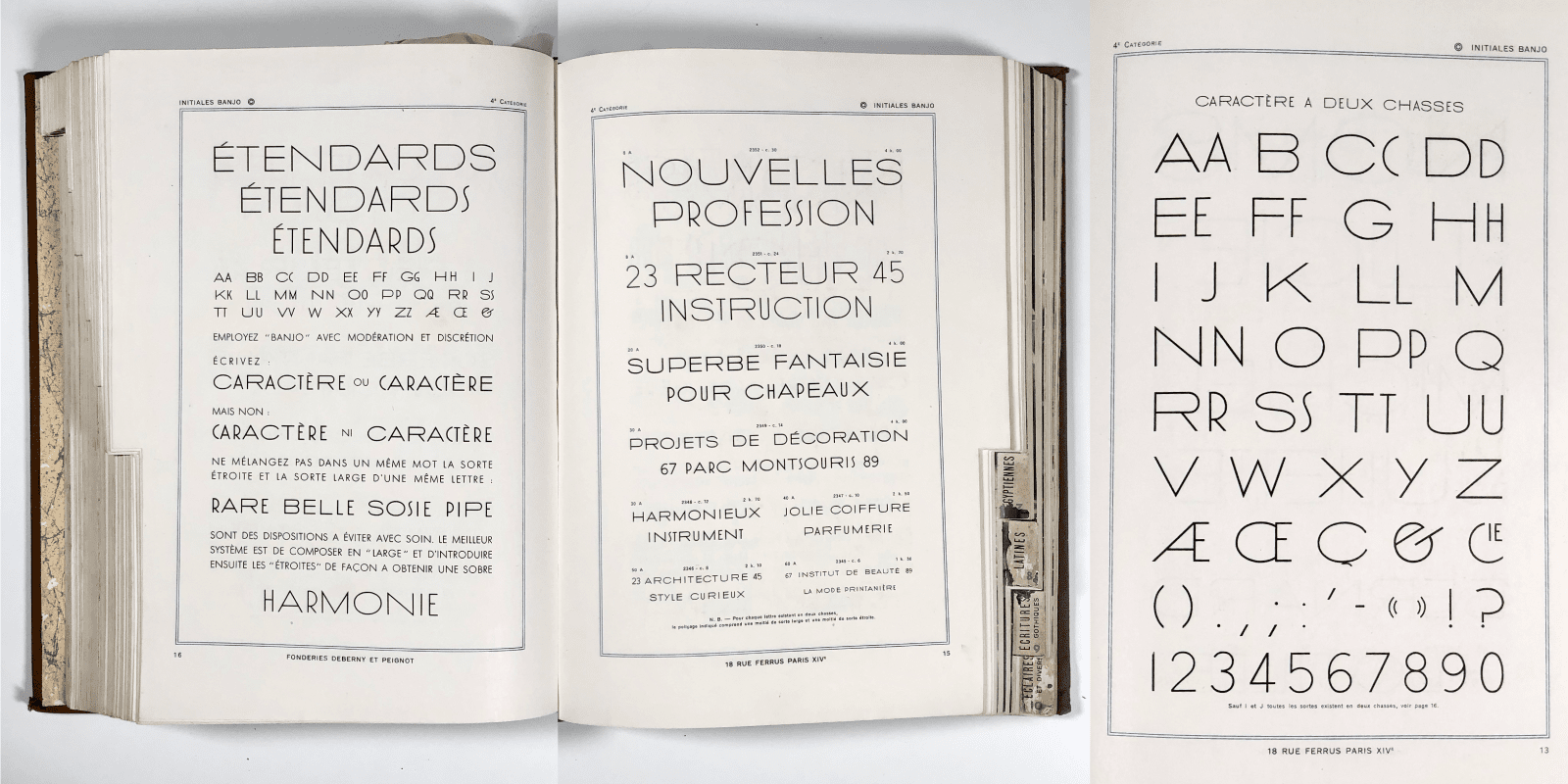
Banjo by Maximilien Vox in Deberny & Peignot general specimen.
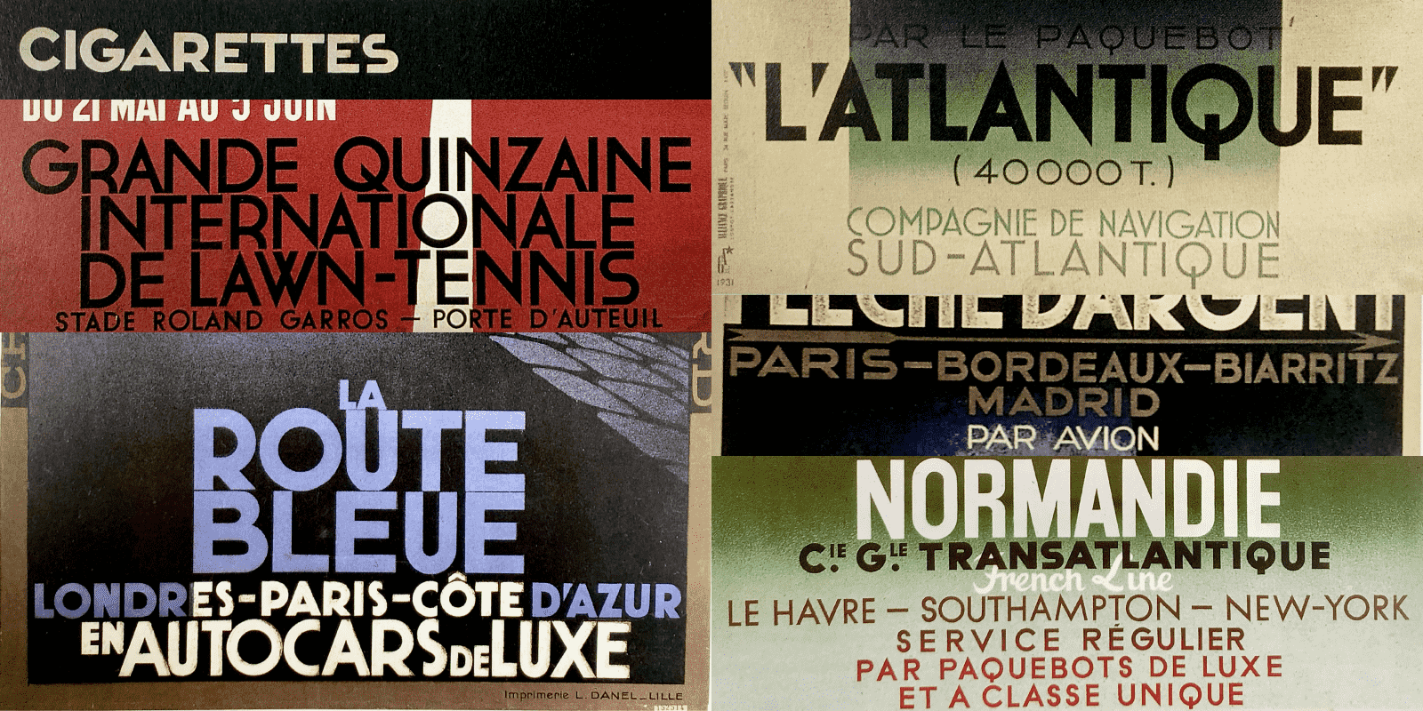
Details from Adolphe Mouron Cassandre posters: he used both multi width sans serifs as well as a wide, sans serif lettering style.
Sources and references of Aiglon
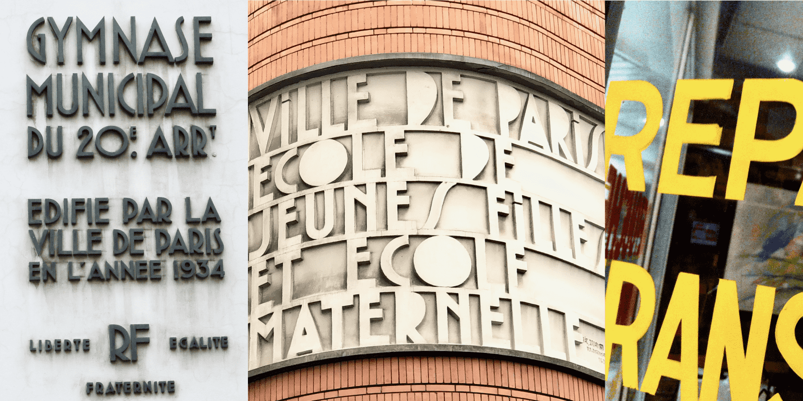
For the Aiglon project started around 2017, one of the multiple sources was this set of beautiful Banjo capitals, formerly used back in 1996 for Anisette, then later for the linear in two weights designed for the Cabinet d’écriture 1 Louis Vuitton in 2012 (no longer in activity). These capitals from Maximilien Vox’s 2 Banjo for the Deberny & Peignot foundry in the 1930s represent the quintessence of a French style more often seen in signage and poster lettering. It is notable that French foundries before the Second World War were limited to display typefaces. The French foundries 3 that designed new typefaces intended for text settings, which were very functional, were limited due to the lack of a local automated typesetting system such as the ones developed by Monotype and Linotype, which were the natural destinations for typeface projects of the sort.
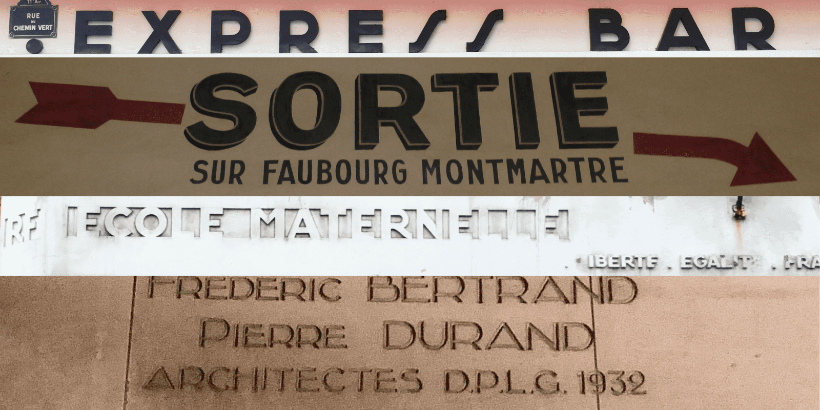
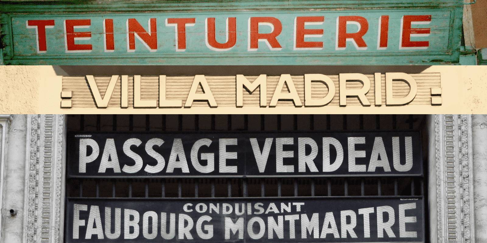
Faubourg Montmartre: Narrow sans serif featuring M and R as in Aiglon. Architect’s signatures in an art deco sans serif style: check the E, A, R
Mono width caps, large counter R.
Signs in Paris in pure Art Déco genre: highly decorative multi-width capitals as well as specific features such as the large R, high mid bar on E.
More mono-width squared proportion caps, narrow geometric caps that can be seen as a source of inspiration for Gotham as well as for Aiglon.
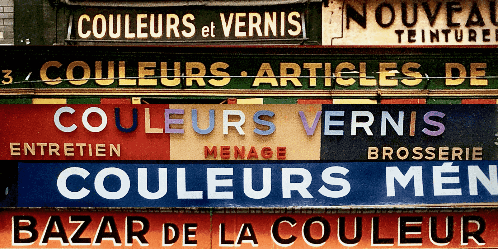
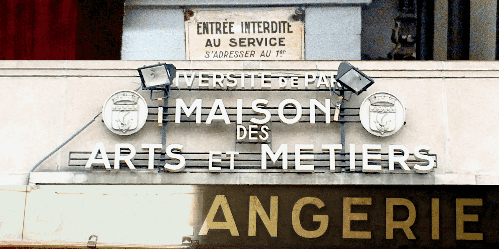
Gérard Ifert, a Swiss designer who arrived in France in the 1950s, took many pictures of painting shop fronts. Very often the shop names were drawn in a style very similar to Aiglon.
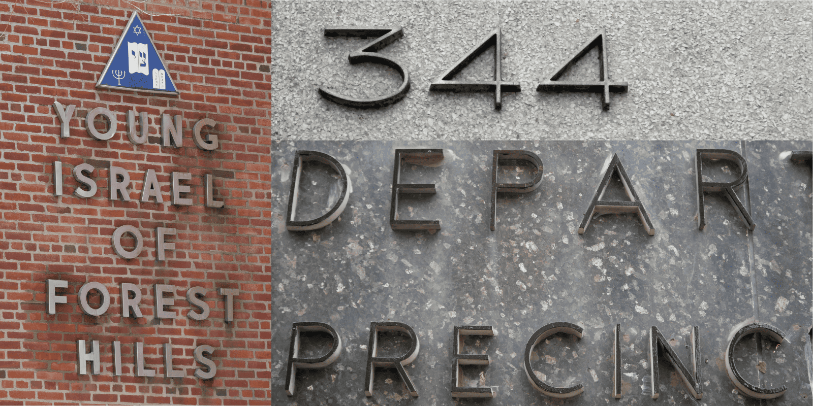
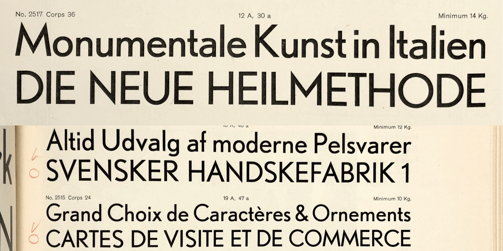
The extensive Aiglon family was built upon many local references: these poster letterforms, those used by Adolphe Mouron Cassandre 4 and other French graphic designers from the mid-20th century. This mid-century style of letterform found on signs is astonishingly frequent in both Paris and New York 5: proportions and certain recurring characteristics are common to both cities. A frequent mistake is to think that the typographic style in vogue during the 20th century is restricted to type foundry collections. This is an over simplification. There are a multitude of typographic forms in use during the 20th century. It remains difficult to confirm the recurrence of styles, because unlike foundries, these usages were not catalogued, they are by definition ephemeral because they were produced by craftsmen of the lettering trade, each developing his own style.6

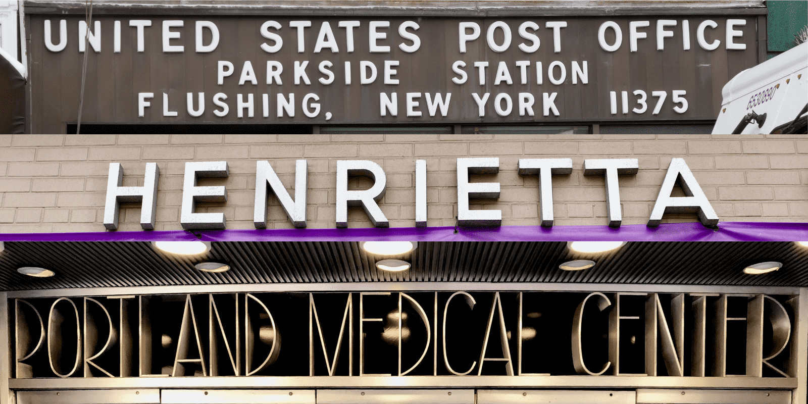
In the United States, most notably in New York, a style similar to the Parisian one can be found. Signs with squared proportions.
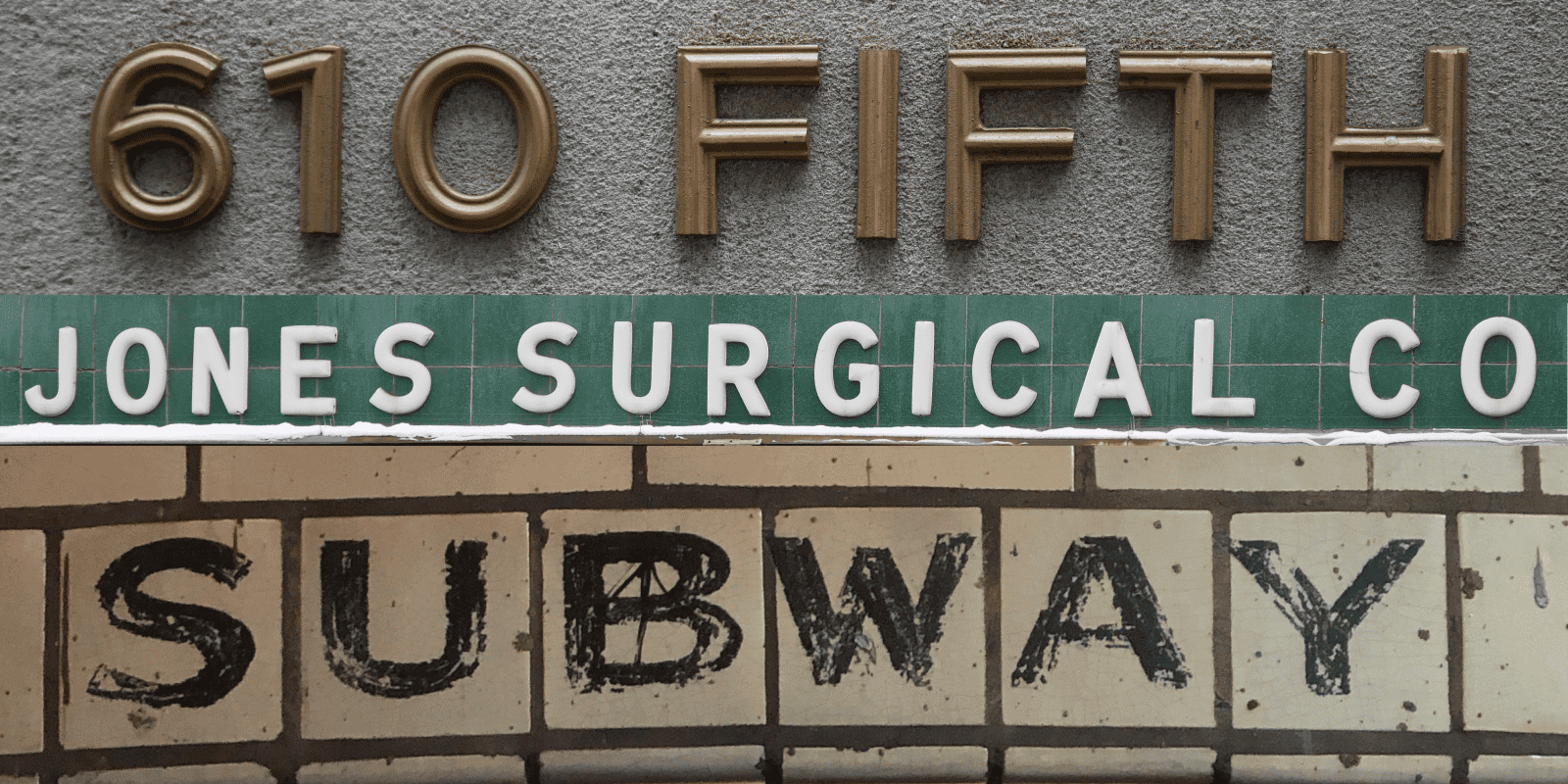
610: Numerals in a width compatible with the capitals is something rare in typefaces.
More signs with squared proportions.
Portland: hairline weight in a pure Art Déco style: high bar on E, low bar on A, large counter on R.
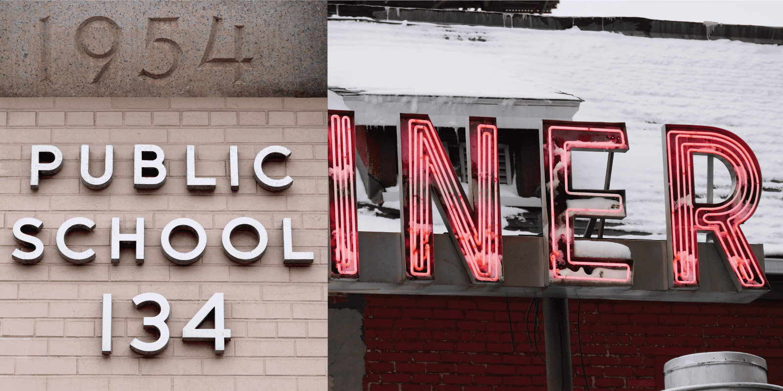
More signs with squared proportions, even in a Neon version.
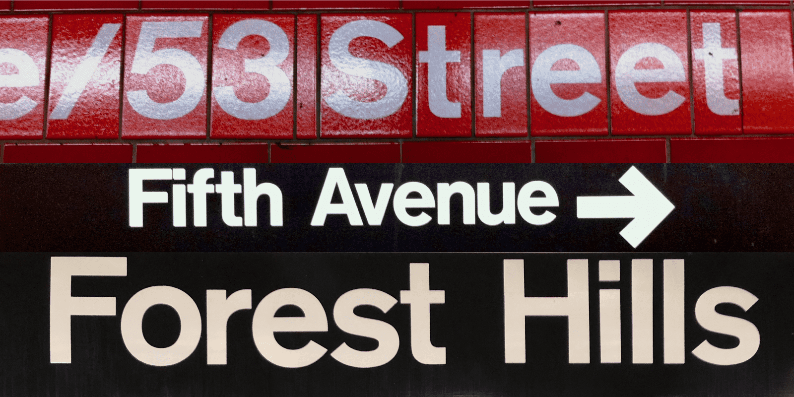
In The MTA subway, there are some rare cases of the use of Akzidenz Grotesk. This specific weight featuring no modulation in contrast is very effective.
Aiglon characteristics
Aiglon is available in five different widths, each one proposed in eight weights with italics for a total of 80 styles. There are no super heavy versions, in order to avoid exaggerations, asserting instead the mono-linearity of the style. The italics are drawn narrower than the romans in order to contrast well in text, as they have no structural differences. These italics are drawn like romans with all the necessary optical corrections of a slanted roman. Aiglon offers two narrow widths in addition to the standard width. The two wide widths highlight a particularity of the Aiglon family: the influence of the lettering inscriptions on facades and shop fronts. Finally, the glyph set follows the Typofonderie Pro 7 standard, with small capitals, different number sets, and dingbats designed in every weight and widths (more on this below).
Aiglon, a profoundly European French typeface
As it might be obvious by now, the idea behind Aiglon is to reaffirm a typical French style, but with a variety of European flavors. In Europe, there are nuances of grotesque and geometric typographic styles. The success of certain typefaces from the end of the 19th century might unintentionally assert a local style: a detail (such as the terminal of the R, or the structure of the M) of its design might immediately refer to a Latin style, while another might seem more English or Germanic, without this detail being in any way the cultural expression of a particular region. It is, in a way, a process of reverse cultural assimilation, because these micro details of sans serifs of a very standardized genre, necessarily reductive. This is the consequence of the omnipresence of vintage typeface specimens accessible today? They are so abstract that they seems disconnected from any formal associations as studied in semiology.
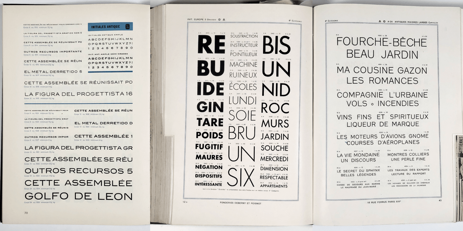
Deberny & Peignot published its own version (actually under a license from Bauer) of Futura under the name Europe, but published other sans serifs featuring non contrasted width and simple “modernist” design. Different from sanserif influenced by 19th century.
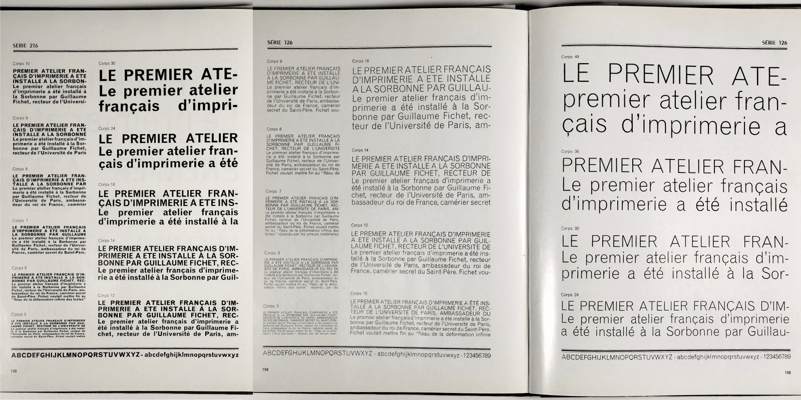
Série 126, Deberny & Peignot
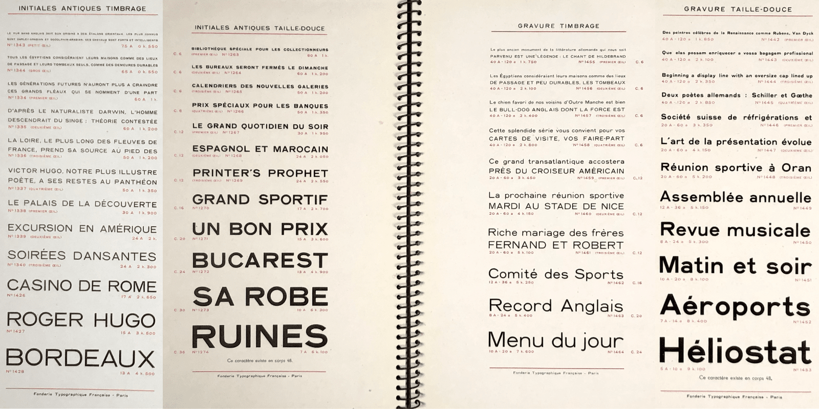
Initiales Antiques Timbrage, Taille-Douce, Fonderie Typographique Française.
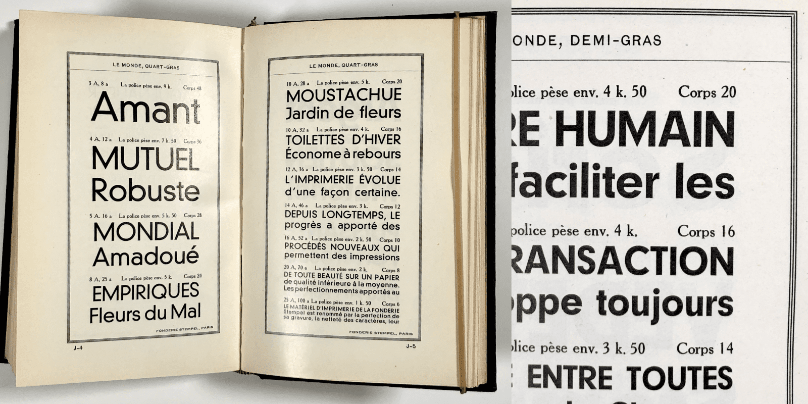
Neuzeit Grotesk under the name le Monde, published by Fonderie Caslon in France.
Let’s nevertheless try to characterize these different typographic tones in Aiglon…
Aiglon Paris – This is the default version of the typeface family! The proportions of the capitals are more cartesian in the sense that they are far from the proportions of Roman capitals. The general style is reminiscent of the Chanel logotype or of certain typefaces like Akzidenz Grotesk; in both cases, the line is monolinear. The lowercase letters are rational, there is no traces of writing. Their inspiration comes more from French Antiques of the late nineteenth century. More precisely 8: the Q design is more influenced by lettering than by foundry typefaces. The S is not mechanical in design, the pointy middle bar finish of the M and W, w are rather influenced by the simplification of the sign painter’s gesture than the punchcutter’s. But what stands out is the deliberately imposing rounded part of the capital R and P.
Aiglon Milano – The E, F, and H have the high bars often associated with architect’s lettering styles. The A bar, on the contrary is very low. These details, when combined with the large rounded part of the R and P clearly signal that it is an Art Deco style. This is also true of the Q with a detached tail, the pointy Z, the “geometrical” a, the ampersand directly influenced by Banjo. Activating the OpenType Milano feature will totally change the text aesthetic. The choice of the name is a tribute to a certain exuberance in Italian modernism, the home of innovative design.
Aiglon Geneva – At the end of the 1950s, Adrian Frutiger designed Univers 9 in a reverse approach to the conservative Germanic tradition of Grotesques. With a simplified G, the tail of the Q aligned horizontally and other details such as the R, it is more sober than Helvetica. Aiglon “Geneva” thus proposes a simplified G, P, G and Q which are directly influenced by these typical sober forms of Univers, the R is even more simplified than the Univers R. Apple addicts will recognize the use of the name Geneva as a nod to the neo-grotesque typeface proposed by the company, that was directly influenced by Univers.
Aiglon Berlin – featuring another R with a diagonal leg influenced by Akzidenz Grotesk. The a and the j are nods to Futura and other pre-war geometrical sans serifs. Indeed, the Z is drawn sharp. With this selection of forms, Aiglon becomes more geometrical in appearance, influenced by the practice of hand-drawn letters using simple shapes: circle, square, triangle.
As you can see, these stylistic sets are present in Aiglon as a demonstration that a sans serif can express a specific connotation by a series of characteristics directly influenced by some of the landmark typefaces of the twentieth century.
Nobel, Lettergieterij Amsterdam.
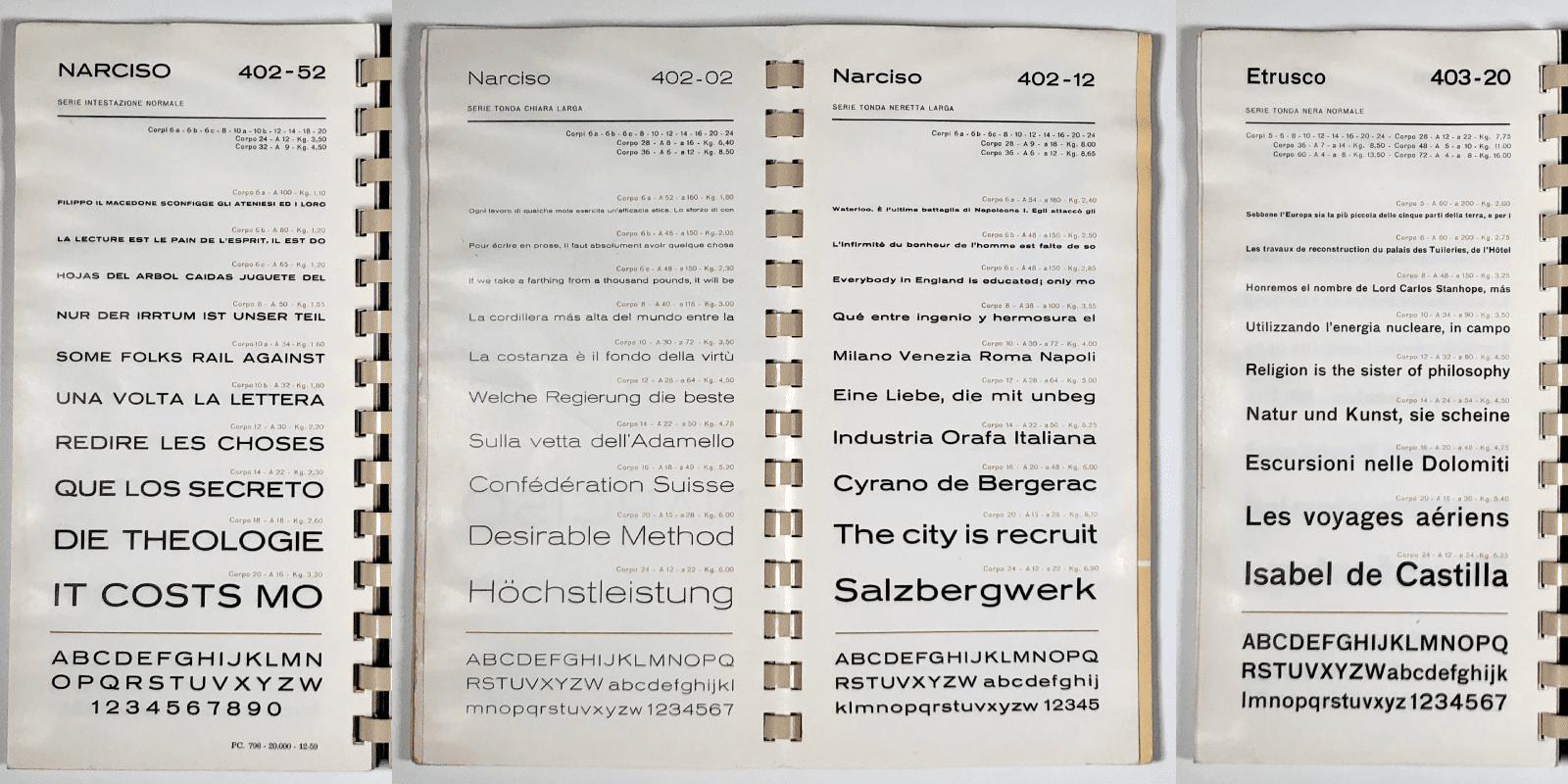
Narciso, Etrusco, Nebolio Foundry.
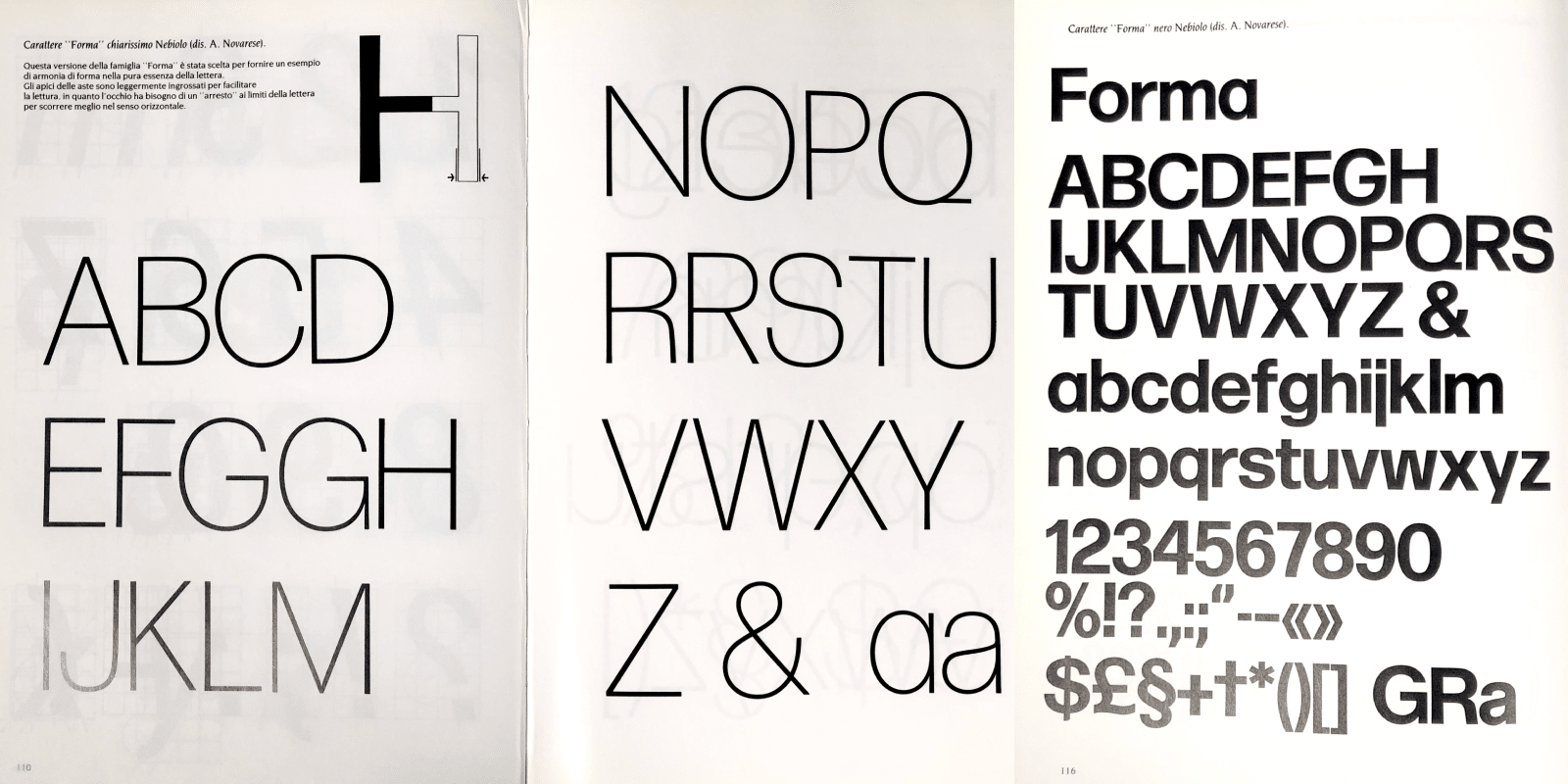
Forma, from Il Segno Alfabetico, di Aldo Novarese.
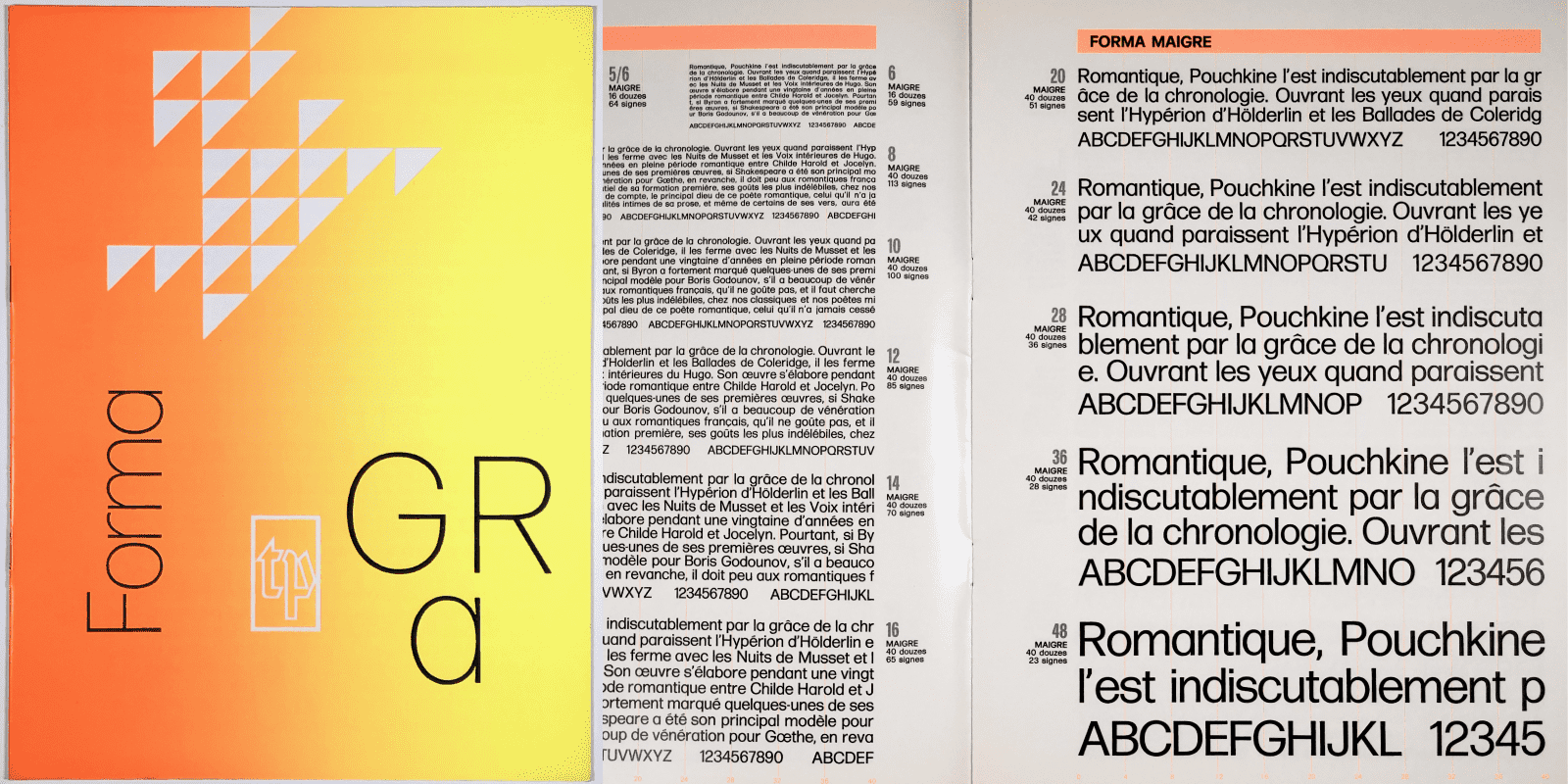
Forma, Nebolio Foundry published by La Typographie Publicitaire in France.
Aiglon and its Proustian madeleine’s
OpenType features transform Aiglon’s style, simply by switching certain glyphs with others. Three different R’s, two a’s, two g’s will change the general perception of the style of sans serif. This is the heart of the demonstration that this project aims to achieve. It is proof by example that what creates the atmosphere of a mono-linear sans serif typeface is reduced to a few identifiable glyphs that, because of their letter forms, immediately relate the typeface to a particular style. As if the shape of the R alone could remind designers of typefaces they had previously used. This is a Proustian madeleine with multiple entries. These different combinations of glyphs trigger our involuntary memory, as in Proust’s madeleine moment: the effect produced does not come from a conscious effort to remember this or that memory, but rather from associated or unconscious references. 10
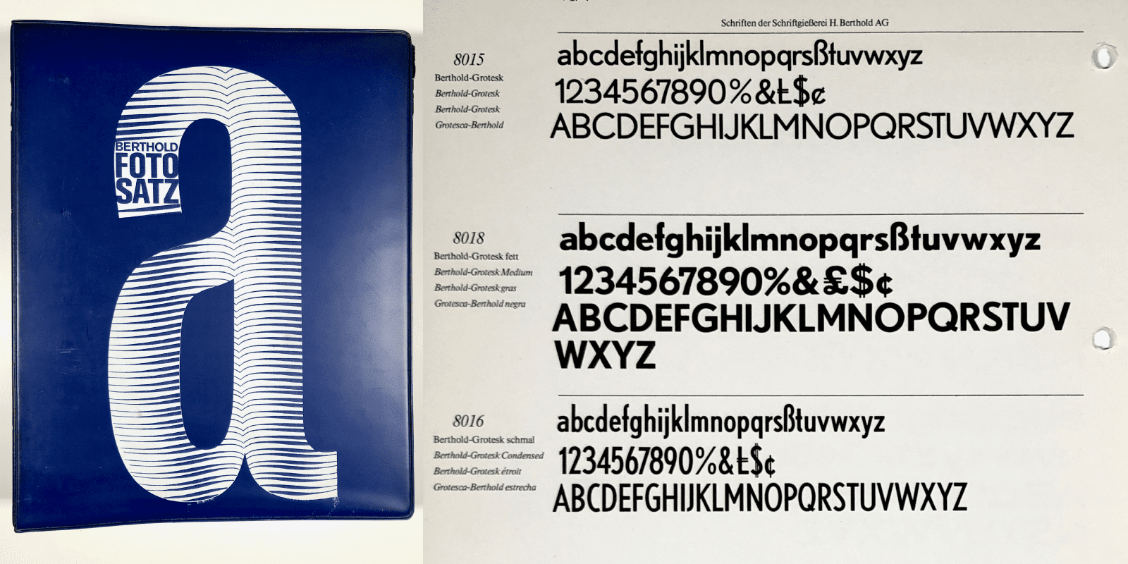
Berthold Grotesk, Berthold AG.
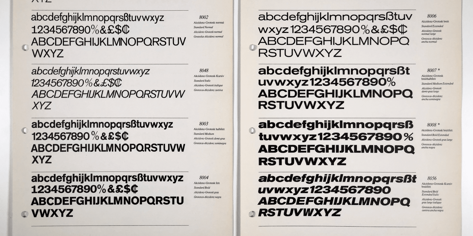
Akzidenz Grotesk in two widths, Berthold AG.
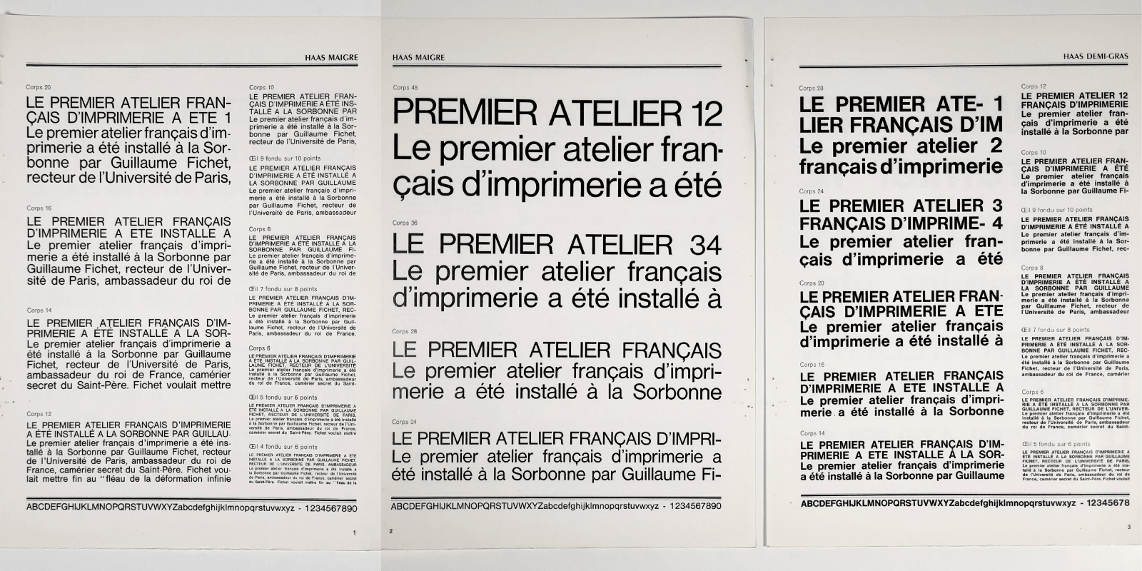
Haas (later renamed Helvetica) Haas foundry published by Marcel Lagrue.
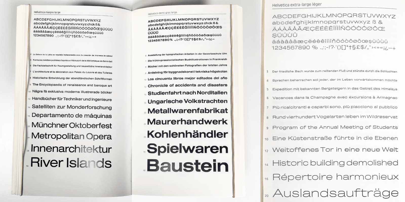
Helvetica, Haas foundry France. Note the Extra large léger featuring an unusual but beautiful wide f and t.
Aiglon numerals
Since the advent of OpenType features, number fonts offer different styles of numerals. Versions aligned with the capital height as well as versions more suited to text usage. Versions adapted to table settings in order to align calculations in columns. Most often, these numerals are the result of a compromise. They are narrow to blend in with lowercase text compositions. These same numerals drawn in line with capitals appear very narrow compared to the latter. The mix of capital–numerals doesn’t work perfectly.
Long ago, in the metal type era, it was common to find capital letters in foundry catalogues with numerals drawn in proportion to the width of these capitals. The intended use was often for stationery, sometimes for advertisements. In another genre, inscriptions and hand-painted lettering in capitals were accompanied by the appropriate numerals: wider, custom-made according to the context: they were designed to blend in with the text they accompanied.
Aiglon is reviving this lost tradition. By default, there are narrow, tabular numerals. But a title, a logotype set in Aiglon with letters and numerals will be harmonious because the numerals are drawn to match capital width by activating the proportional aligned numerals OpenType feature. Some particular details are specific to these wide designs: the 2 more pointed and rounded, the 4 open, the 7 pointed. The versions adapted to lowercase text settings also offer two variants, including the non-tabular version, which is perfectly suited to lowercase color. Finally, if the graphic intention is more rational, an OpenType feature allows one to associate a visually adjusted number 1 with the original tabular numerals. Similarly, different percentage variants are available for both lowercase and capital numerals, for the latter in two variants.
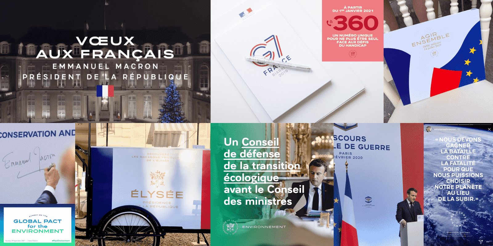
Aiglon is the official typeface of the Palais de l’Elysée, used for the identity as well as for the communication of President Emmanuel Macron.
The choice of the name Aiglon
The history of the Palais de l’Élysée and its architectural references are linked to the political history of France, particularly the Napoleonic period. This inspired the name, as this typeface was originally designed and is currently used for the Palais de l’Élysée and the French president, Emmanuel Macron.11
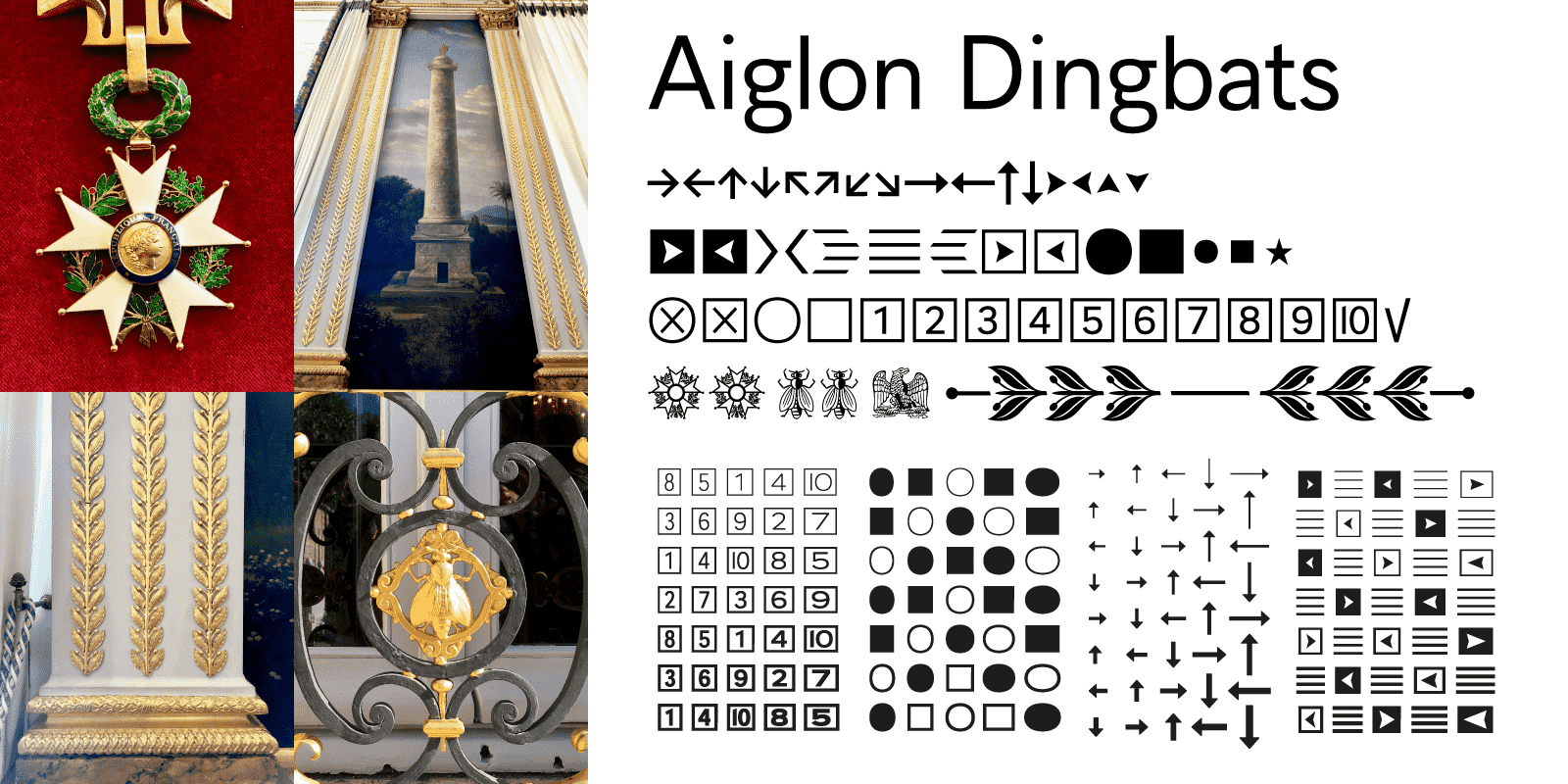
Aiglon Dingbats are available in various weights and widths. Some of them are designed as a tribute of the history of the Palais de l’Elysée and the history of the French Republic.
Aiglon Dingbats
In 2001, Ambroise offered vignettes and dingbats in a variety of weights and widths. Many other Typofonderie families follow this principle. For Aiglon, numerals in squares are adapted to each series. Different arrows, squares, circles and stripes are available in weights and widths allowing almost infinite combinations. Some vignettes and specific borders pay homage to the Napoleonic period (in connection with the history of the typeface): details of the interior architecture or references to the French Republic, such as Napoleon’s eagle, the bee and the French Legion of Honour medal.12
References
Cabinet d’écriture, a collection of unique alphabets for Louis Vuitton.
2Maximilien Vox, Typographer, etc.
3The rich diversity of Deberny et Peignot’s specimens.
4A.M. Cassandre, Œuvres graphiques modernes, 1923-1939, BnF
5Paris: Graphique de la rue, Louise Fili.Italy: Grafic Strada, The signs of Italy, Louise FiliNew York: Store Front, The disappearing face of New York, James and Karla Murray.
6Paris Couleurs, Gérard Ifert ektachromes 1953-54, B42
7Typofonderie PRO fonts versus STD fonts
8 9 10 11Le Palais de l’Élysée et son histoire
12Aigle, abeille, légion d’honneur: la symbolique Napoléonienne